NEWS & ARTICLES
THE LATEST IN WEB, SOFTWARE, AND DESIGN
Web Design Trends
Web Design Trends in 2018
In 2018, web design trends will focus on designing simple but powerful websites that are well optimized for mobile devices and heavily focused on user experience.
Is your brand’s website ready for what 2018 has to bring? The team at Drift2 Solutions created this checklist for you:

Growth-Driven Design
What is Growth-Driven Design and how does it differ from traditional website design? With traditional website design, a business recognizes their website is underperforming or outdated, and a redesign is needed. A designer or agency is hired to redesign the website. Based on design trends and new search algorithms, designers produce a new site, launch it, and release it to the client.
A few years pass, new design trends and search algorithms progress, the website redesign process is repeated. This process is reactive and costly, as every 4-5 years website redesigns are needed based on changes in technology and design.
Growth-Driven Design uses a proactive approach to constant development. This method of design allows for a continuous cycle of strategy, design, analyzation, optimization, and improvement.
We create drafts of your website and work with you during each step of the creation process. Instead of redesigning and turning the site over to the client when finished, the site is continually updated according to latest trends to improve traffic. We train you how to use your site correctly. In the long-term, the Growth-Driven Design process costs less and is a more efficient than traditional design—the website is always evolving; the site grows with your business.
Mobile First Indexing & Design
In 2017, mobile usage for Google searches began to outrank desktop usage, with 55% of searches done on mobile devices. With the rise of mobile, Google’s mobile-first indexing is set to release this year. Mobile first indexing means Google will rank your websites based on how they respond, look, and feel on mobile devices over a desktop. A site may be sleek, stylish, and fast on a home computer, but could be slow, clunky, and not optimized for mobile devices at all.
To combat the mobile-first era Drift2 recommends two options: responsive web design or an AMP version of your website.
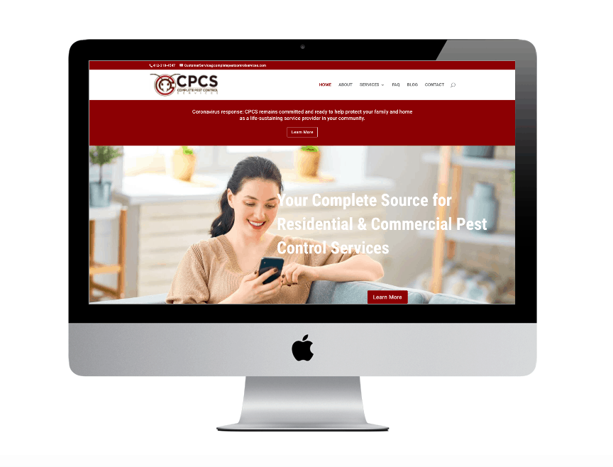
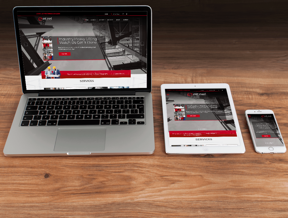
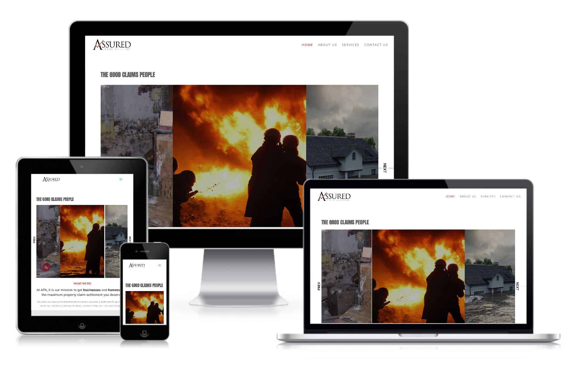
Responsive web design allows your website to function correctly on devices of any size. With responsive web design, your site has single functionality between desktop, tablets, and mobile devices. Navigation tools are built to align with any sized screen ensuring complete control even when using a touchscreen.
The second option to become mobile friendly in 2018 is having an AMP version of your site’s pages. AMP stands for accelerated mobile pages, an open source project started by Google to increase functionality and speed for web pages on mobile devices. AMP pages feature a minified version of a page’s HTML and Javascript, allowing a page to load four times faster than its non-AMP counterpart. AMP pages prefer function over flare, so AMP may not be right for you if your pages are rich with flashy features, but AMP web pages load fast and look clean. AMP’s ability to load pages faster than ever is a fantastic reason to give up some flare though, as seen with North American fashion retailer Nordstrom. Nordstrom saw online sales fall 11% when its website response time slowed by half a second, says Gopal Brugalette, the retailer’s senior applied architect in performance engineering at the time.
Mobile first is a significant trend to stay on top of in 2018. Your site will be viewed more often on mobile than desktop. Make sure your site looks great and loads fast on mobile with a responsive web design or an AMP version of your page.
Custom & Bold Typography
Gone are the days of every website having a standard typestyle. 2018 will feature more custom, big and bold typography. Improved screen resolutions and technology improvements allow for web designers to experiment with custom fonts.
Bigger and bold font statements help draw attention where it is needed and improve user experience through ease of reading and drawing attention where it should go. Overall, custom fonts and impactful headers help keep the focus on your site longer and delight your audience with unique features.
The Return of Brutalism
In web design, a mainstay compliment of any site has for years been that a site looks “clean.” Clean web design implies a website that is easy to view, read, and navigate. Brutalism is clean web design on steroids. Brutalism cuts the excess flare out and leaves a website with stark contrasts and little to no animations on the page. Brutalism trends include dark backgrounds, monospaced typography and white and lime green text.
Brutalism could become a major trend of 2018 in direct relation to Google’s mobile-first indexing. Since brutalism cuts out the excess of design, brutalism is already mobile friendly and in most cases AMP ready. Pages load faster and are easy to view on mobile devices. Brutalism could help with conversions by utilizing faster load times and smooth user experience, thus becoming a trending style of 2018.
Bright Colors and Gradients

2018 will see a return of gradient colors. Gradients were popular before flat design became a popular trend, but were set aside for fresh design choices until recently. New-style gradients employ flat design elements, including colors, to stay current and add a new level to the look. Some examples of color in gradients are hues borrowed directly from flat design palettes. These color choices help give gradients a modern feel that seems to mesh with other website trends.
Gradients employ a sense of minimalistic design that is easy on the eyes, following along with a trend of minimalism as a web design trend of 2018.
Asymmetrical & Unique Layouts
For years website layout has stayed consistent. User interface has tended to make things as simple as possible for website visitors. In 2018 we will see a break away from the standard web design layouts and navigations. Asymmetry will become more popular because of this trend, as well as more experimentation with the shape of navigation bars from a standard horizontal menu to a menu that may employ unique shapes and designs. Page alignments will vary as well as font sizes and styles.
This free form of page layouts offers a unique way to design web pages, but should still focus keenly on user experience. If a consumer cannot navigate the pages properly they may miss valuable information or feel confused, so more bold layout choices should be crafted explicitly with the user in mind.
SEO Design Trends
SEO in 2018 will follow many of the same mobile-first, minimalistic trends. SEO will always focus on genuine, valuable content, and SEO in 2018 will triple down on these concepts. Gone are the ways of keyword stuffing. SEO in 2018 will rely on bringing quality content to users, and focusing on content the end-user finds valuable.
Businesses utilize Search Engine Optimization strategies to generate leads, direct web traffic to their site and increase visibility to customers. We have a proven system to improve your search list rankings:
- Link Building – Find mentions to your content that are currently unlinked, identify resources and other web pages that contain broken links and establish links.
- Local SEO – Accurate local citations and geo-tags. Local citations list your business in geographically-based maps and directories. We also place geo-tags (city, state) on your relevant pages and develop content that is specific to that geographic market.
- Blogging – Identifying target keywords and build blog posts around those keywords. Your site can rank as high as possible in search engine result pages and increase traffic through keyword optimized blogs.
- Technical Audit – Checking broken links, duplicate tags, load times, responsiveness, site indexing, and additional cues through schema to guarantee search engines understand the content on your site.
SEO web design trends will develop with more long tail keyword choices than ever due to the explosion of voice search. Amazon Alexa and Google Home have voice searches more accessible than ever, and in 2018 SEO specialists will focus on long tail keywords and phrasings that relate more to how people speak.
Your 2018 Web Design Trends Checklist

Web design trends of 2018 offer a break away from the standard of web design, yet pull from older styles of design thought to be lost by the wayside. Minimalism and speed will take pertinence over flashiness. However flashy design can still be used in unique ways that do not hinder page speed. As consumers become more inundated with web pages, and technology allows higher resolutions and page sharpness, web designers can implement unique web designs and styles more often.
Website problems? We are problem solvers. Get in touch, and we will give you a free website analysis to check your site’s SEO, responsiveness, speed, mobile readiness, and design.


