3 Tips for a Mobile Ready Site in 2018
Your site needs to be mobile ready in 2018. The option for you to have a website that performs well and looks good on desktop only has passed. 2017 marked the point where the number of mobile searches through Google outranked the number of desktop searches. People made 55% of all searches through a mobile device in 2017.
Google has slowly begun to roll out mobile-first indexing because of the explosion of mobile searches. Mobile first indexing means Google ranks your website according to how fast it is on mobile devices, as well as how it looks. Do not get left behind with mobile first indexing. Check out these three tips to have a mobile ready website in 2018.
- GET RESPONSIVE!

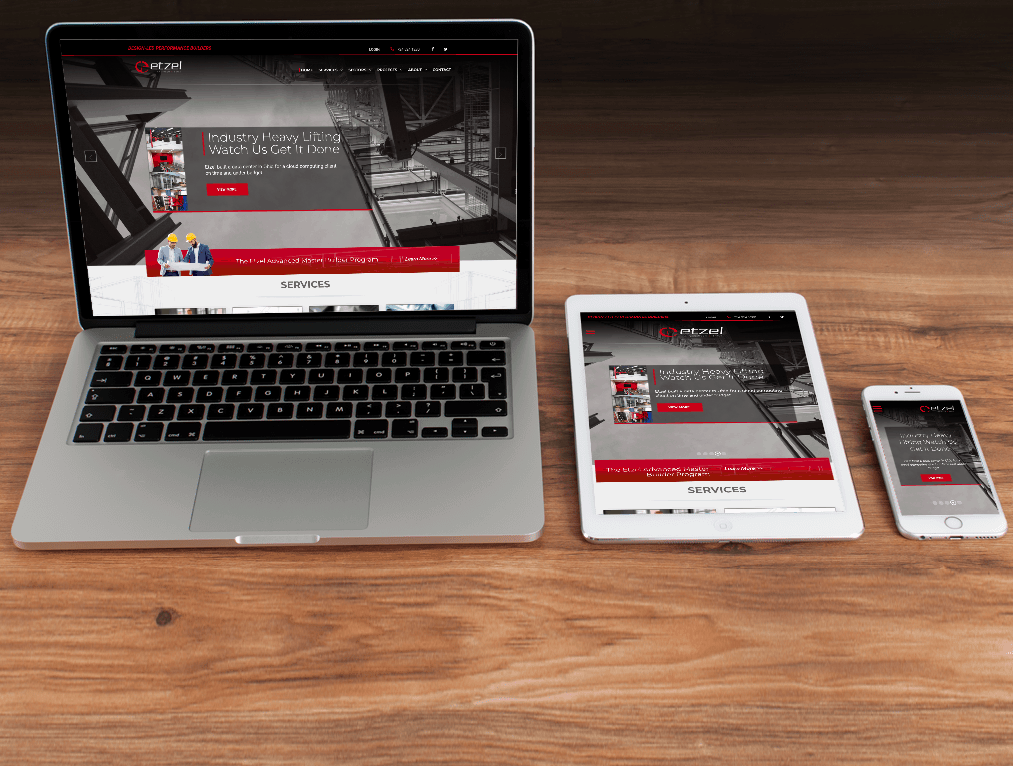
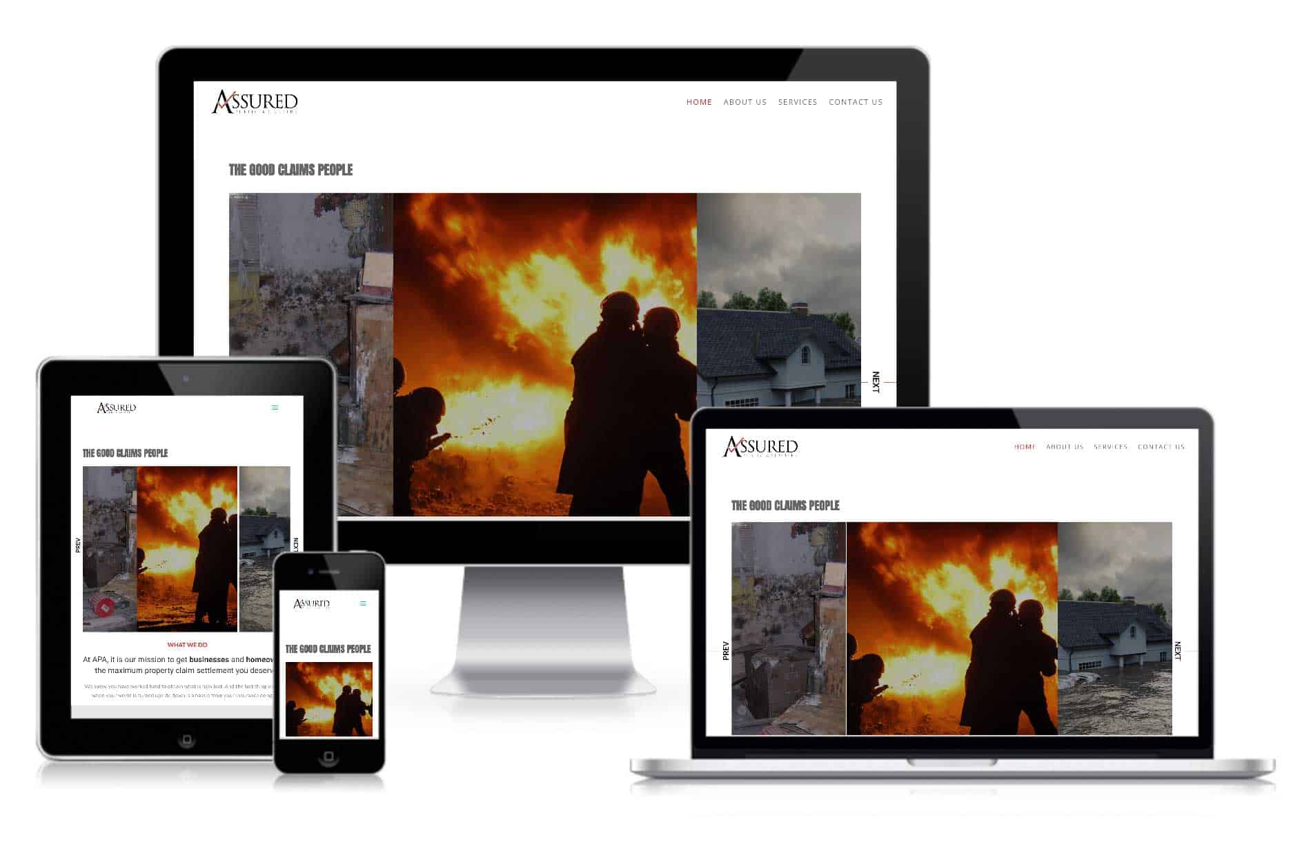
Responsive web design is the best way to ensure your site is mobile ready. A responsive site means that your website reacts to the size of a screen, so it looks good and works correctly no matter the size of the device. It is essential that your site is responsive for SEO and user interface purposes. Google will not rank your website well if it is non-responsive, especially in a mobile-first world. Potential customers will not stay on your site long if they cannot navigate the layout.
If your site is non-responsive, this is an immediate change you must make. For a mobile ready website, responsiveness is of utmost importance.
2. CHECK YOUR MOBILE SPEED

If you have a responsive website, your next goal is to make sure it is performing well. A slow mobile site will hurt your chances of ranking well, as well as cause potential customers to leave before even visiting the site. Your site speed is determined by image sizes, JavaScript, and CSS, along with other factors.
To check your mobile speed score, you can use Google’s free tool here. Contact us today if you have any questions about what your mobile score means and how to improve it.
3. GET AMP’D

Another way to ensure your website is mobile ready in 2018 is to use Google’s open-source accelerated mobile pages project. AMP is an effort by Google to speed up the web. It helps create fast pages for mobile by streamlining the amount of HTML you can use for a site. AMP pages are some of the fastest on the internet, and Google loves them too, so there is potential to rank higher on Google searches with AMP. AMP is the most foolproof way to ensure a mobile ready site.
Get your website mobile ready in 2018. A mobile ready site will improve your website’s visibility on the internet, enhancing your chances of conversions and brand awareness. Google will like you more if you are mobile ready, your potential customers will like you more, and you will like your website more.


